A logical development.
Ten Years. | 23.07.2021
Ten Stories: The idea becomes a brand - the path to our logo.
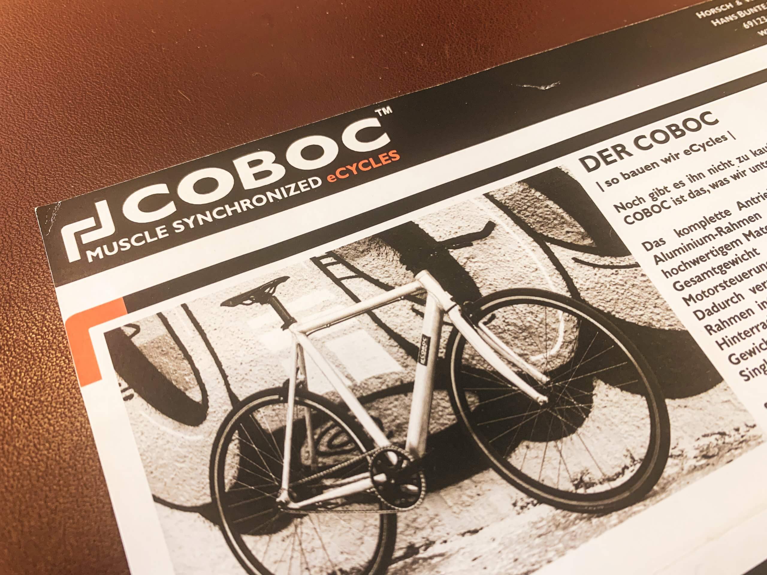
When physicists lock themselves in with the idea of building a beautiful electric bike, there’s no talk yet of typical marketing slang like branding or positioning. The product is in the foreground. That’s why one thing above all was important to the two Coboc founders: A “cool buck” should also make e-bikes interesting for younger people – reduced, stylish and intuitive to operate. With the Slim e-bike a completely new market was born.
FAT.
However, the first logo was initially still in contrast to the design of the first market-ready model. The two founders presented the eCycle at the Eurobike trade fair in Friedrichshafen with a brute font in capital letters, an angular symbol and the addition “Muscle Synchronized eCycles”, which was intended to emphasize the bike’s natural riding feel – wild times indeed.


Motion Engineering.
With the adaptation of the corporate identity in 2014, a new path was taken. For the first time, Coboc’s identity was clearly reflected in the logo. The typeface was significantly slimmed down, symbols disappeared and capitals were only used in the new slogan “Motion Engineering”. The technical style was emotionalized with a bright blue tone. As a visual highlight, the blue circle from the logo was also found on the motors at the time. The first colored Coboc models made it disappear there again – Colors are not arbitrarily combinable.
Slim. Simple. Sleek.
The last change to the corporate design to date was to follow in 2021. Coboc has long since transformed itself from a product idea into a versatile company without forgetting its roots. The design DNA combined with the pioneering spirit of our founders still defines the approach to the development of new models and makes each of our e-bikes unmistakable. But the employees have also long lived these values within the Coboc Culture, where innovation is encouraged with a positive culture of error and authenticity is valued. These are precisely the values reflected in the new logo. Slim, simple and sleek.


What’s new. Design Talk.
To give the logo a timeless simplicity, the formerly typographic circular shapes are now completely symmetrical. To achieve this, the angles of the individual letters are aligned, and the color and claim are removed – it couldn’t be simpler.
A new type family, used in a mix of light and heavy, italic and regular weights, creates a modern look in which innovation and lifestyle merge into one.
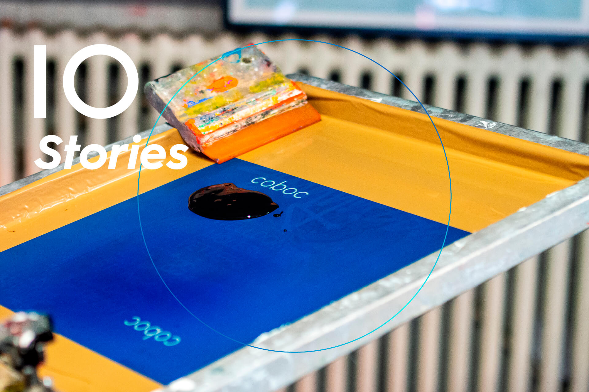
The blue circle disappears from the logo, but reappears in a new form as a decorative element. Now much finer and in the course of two shades of blue, almost as if you could catch a glimpse of the lively interior of the Coboc e-bikes. There, where currents flow and algorithms race. There, where the magic happens.
Coboc turns 10.
Around our anniversary season we have prepared some promotions and stories for you. Check out our Ten Years page to make sure you don’t miss anything. Or click directly to the Ten Stories.
share article
Coboc Newsletter
You always want to be up to date?
Subscribe to our newsletter.